Sunday, May 16, 2010

Will the real artist, please stand up?


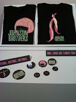
I was really lucky to have known Michelle Anderson before the gallery, because I was able to talk a lot with her afterwards about her artwork, the gallery, and how everything went down for her. I was even able to sign her guest book, which made me pretty happy as well. But one of the most interesting things we talked about, was the concept of real art, and if there was such a thing. We've been talking in class about advertisments and such, and if they are considered art, and then this past week two out of the three walls of the gallery were covered in graphic design. Don't get me wrong, I love graphic design, and I thought some of the stuff in the gallery was awesome promo stuff. But what about Michelle's work? Creative expression, paint, photography...all things I couldn't have done in a million years. We talked during class about whether or not we could just create abstract art, and I admitted that I couldn't. However, I'm pretty damn good with computers and feel that some of the promo stuff, I could have created myself.
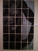
I think there is an emotional level thrown into Michelle's art, as opposed to the other two artists. I feel like graphic design, although it is art and I strongly believe that, is commercial art. Consumer art. Capitalist art. Where paintings, photography, moments in time...are captured. They just are. Without anything else around them, with nothing to promote and nothing to gain, they can exist. They require no computer, no program, no printer. They require a human, and a paint brush, pencil, pen, charcoal, whatever...and they are sprung into life.

Friday, May 14, 2010

Can't Find Your Team? Finish Line Ad Reversal


Can't Find Your Team? Finish Line Ad
  1. There is no setting in this ad, just a white background with the team logos present underneath the text. Since all schools are currently open for academic enrollment, the assumed time is now.
  2. There aren't necessarily an "who" subjects presented in this ad, as much as there are "what" subjects presented, in which case, the subjects would be the universities shown.

  3. There are no other images present in the ad outside of the school logos.

  4. The story/meaning behind this ad is that as a consumer, if you can't find the sports team sweatshirt you are looking for in the catalogue, you can either go online to Finishline.com or into one of the stores to find the sweatshirt you want.

  5. Copyright of ad - 2009. Publication: 2009 Finish Line Holiday Catalogue

  6. The relation between the audience and the ad is that the ad is suggesting that by shopping at Finish Line, they will do whatever it takes to find the school you are looking for, making your holiday shopping a lot easier with a lot more options.

  7. The kind of person that is meant to see this ad is someone who is one of two things: an alumni member of one of the various schools, or more likely, sports fans. It is assumed that if you are shopping in the Finish Line catalogue, you enjoy collegiate sports.

  8. I don't believe that the makers of the ad are trying to draw any different kind of consumer, because they target mostly sports fans, as they are an atheltic shoe store. They carry atheltic shoes, apparrel, and accessories, and I think that they are trying to "add on" to what they carry by promoting the NCAA merchandise.

  9. There aren't any markers of race, ethnicity, gender, age, religion, class, or sexuality presented.

  10. The relationship between the text and the imagery is vital to the ad, because the text is a direct response to what you see in the ad. There are many different school logos presented, but not every school logo in the nation, or Division I sports for that matter, so the chances are many of the schools actually AREN'T on the ad. The object is to try and find your favorite teams logos, and when you can't, rely on the text to help you out.

  11. There really isn't a relationship between the ad and the product. The product is not shown, but the ad doesn't promote a lifestyle either. The only mention of the actual product being a sweatshirt is in passing during the beginning text of the original ad.

CONSUMER COMMENTS: This ad worked on me, because as an Ohio State football fan, I didn't see the Ohio State logo, and then relied on the text to know what I should do when I really can't find my team. Finish Line isn't the only store to use this type of ad either. When Victoria Secret started carrying an NCAA line of pajama's and shirts for women they did the exact same thing in their fall line catalogue for dorms.


Camel Ad Reversal


Camel Alternative Ad
  1. There is no setting to this ad, just a few products in front of a blue background. It is assumed that the time shown is the present.


  2. There are no "who subjects in the ad, just the products themselves, which are all dissolvable tobacco products from Camel.


  3. The main subject in this ad is the product line. However, it's also important to note the key image of the camel logo in the top right hand corner.


  4. There isn't a plotted story behind this ad, however there certainly is a meaning to it. The text "Enjoy the Evolution" shows that now, in order to obtain tobacco, you don't need to smoke/inhale or chew, but can literally take a strip, stick, or orb and let it dissoble, allowing tobacco to still enter your system without having to hardly work at it.


  5. Copyright of ad 2010. Publication - Sports Illustrated, Super Bowl Issue, February 15, 2010


  6. The relation between the ad and the audience viewing it is that the ad is providing an easier way of life for people who use tobacco products.


  7. My assumption is the type of person that was meant to see this ad was someone young, who understood the "evolution" being presented. The packagaing of the product presented targets a young audience, and the dissolvable tobacco comes in flavors such as "fresh" and "mellow" which easliy go along with the "break free" tagline that Camel uses.


  8. I'm not sure that the makers of this ad are choosing to target a different audience, because Camel ads have always gone after a younger crowd. The cartoon camel with sunglasses, evolved into the black and hot pink cigarette packagaing, to now the ad presented today.


  9. As mentioned before, there are no markers for race, ethnicity, gender, sexuality, or religion - but certainly of age and class, targeting a young "up and coming" hipster audience.


  10. The relationship between the text and the imagery are directly related, showing that the evolution described in the text is located wihtin the product itself, right down to the colorful packaging and labeled flavors of "fresh and mellow".


  11. The relationship between the ad and the product are directly related, because unlike most ads that promote a type of lifestyle, the product is actually shown. So in this case, the ad is promoting the actual product.


CONSUMER COMMENTS: In all reality, I do not buy tobacco products. And considering that the product here was shown, rather than a beefed up guy in his twenties, I didn't even think twice about stopping to look. It's a boring ad. The whole reason I chose this ad as a part of my ad reversal project is because of the giant, glaring warning from Camel in the botton right hand corner of the ad that notes: "This product is not a safe alternative to cigarettes," which is what really sparked the idea for my reversal in the first place.

Sunday, May 9, 2010

Turning an Ad from Marketing to Pop Culture

In a culture of consumerism, it's not necessarily about the ad, but rather what the ad itself does and it's purpose in society. As a member of the Millenium Generation, fascinated by things that become a part of our culture and who we are, I honestly say that the products I choose to buy I have a perfect rationale for, and it has everything to do with the way they market their product. For example, I prefer Coke over Pepsi. Outside of the obvious taste difference, Coca-Cola is marketed as a nostalgic piece of America - even the logo and the phrase "Coke Classic" And it's like this for multiple things, especially if you can make it a part of the pop culture.


Songs play an important part in advertising too, and could be considered miniature clips of film as far as television ads go. Take, for example, the Mitsubishi Ecplise ad from 2003 featuring the song "Days Go By" by Dirty Vegas. http://www.youtube.com/watch?v=OH0zWrDi6GA Or the new Heiniken commercials with the tagline, "Let a Stranger Drive You Home." http://www.youtube.com/watch?v=2jqZTJk30qg

Advertising is most certainly an art. An art with a motive, that envokes emotion, and has a purpose. Whether it's on television, in a magazine, branded on a pop can or a box of crackers, it's everywhere. However, I believe it's most effective when it becomes more than an advertisment, but rather a part of who we are. When it embraces the culture and becomes a part of what we do and see and hear every day. Advertisments are a huge part of popular culture, making being a part of culture, popular.

Gallery Analysis - Billy Fry

During the first gallery talk we've been through as a class, I seemed to really like and was impressed highly with the work of Otterbein artist Billy Fry. He had several different pieces in the gallery, including a few self-portraits, some acrylic paintings, a mixed media on nine small canvases, and two pieces done in walnut ink.


The two pieces I chose to really analyze of Fry's were the mixed media on canvas, entitled "Impressions of Metropolis," and one of the two walnut ink pieces, entitled "One Way." I picked the two of these because, although they are done in completely different venues with different media on different canvases, they both spoke to me about the city and what it's like to be alone within it.


Both pieces of work, despite their differences in color, texture, and other elements of work, I feel, speak about the same thing. About what it's like to be alone in the city. The perspective is amazing, how alike it is that we see a view from someone beyond who's in the painting, as if we are following around the man in "One Way" or peeking over the nine different viewers in "Impressions of Metropolis." Either way, I fell in love with both pieces, because they really define the "city sleeping alone."

Friday, April 23, 2010

What You See, Isn't Always What You Get

I love the idea that anything can have any perspective. It messes things up for a lot of people who like straight answers, and I love the artist who takes the high road and says that a straight answer is nothing but bullshit. In class we looked a lot at Georges Braque, and a lot of his stuff is really cool, but even more so, I like the things that David Hockney has done. When talking about modernistic styles and perspective in chapter four, there is an awesome note about Hockney's "Pearlblosson Hwy." The way we look at things from person to person is what I'm really getting out of the class so far, and so who better to look at than some of David Hockney's works?


My favorite Hockney while researching some of his works was Place Furstenberg, Paris. It's photographic collage that contains a lot of the same elements that Braque's paintings do. Also, in most of Hockney's paintings, he uses a lot of greens and blues, bringing out the cooler to colors to give us a more natural look of sky and earth. Modernistic styles have grabbed my attention more than anything so far in this class outside of Edward Hopper's works, but I think it's a matter of opinion. I only enjoy ceratin impressionstic and cubic pieces, but really like a lot of the abstract work, especially in what we saw out of Marla in the film today. I look forward to seeing some more of her work, and comparing with other artists in the genre.

Friday, April 16, 2010

Live Creatively, Dangerously

I totally agree with the artist quote of the week, that creativity is indeed the capacity in which we allow ourselves to make mistakes, and art is the good stuff we decide to keep. Life is full of mistakes, whether we intend for them or not, and what makes "the good stuff" - the stuff that defines who we are as people - that's art. This is a quote that allows artists to be a little dangerous, to step outside the box and allow themselves to not only try new things, but to fail at them succesfully.

How does one fail succesfully? By keeping the mistakes that make art. I don't believe that any type of art is just thrown into the air on the first try. One of my favorite pieces of art, is Nighthawks, done by Edward Hopper in 1942, because to me it is a representation of nostalgic America, someplace I myself would want to be. However, Hopper's creation in 1942 was actually done forty years after his first work began in 1902. And no one can tell me that Led Zepplin's Stairway to Heaven was done in one try, or that the first production of Chicago was the best. I don't believe it.


So yes, I agree that if we allow ourselves to make mistakes, to keep doing what we're doing over and over again, to figure it out for oursevles what the "good stuff" in life really is - then we're finally creating art.