In a culture of consumerism, it's not necessarily about the ad, but rather what the ad itself does and it's purpose in society. As a member of the Millenium Generation, fascinated by things that become a part of our culture and who we are, I honestly say that the products I choose to buy I have a perfect rationale for, and it has everything to do with the way they market their product. For example, I prefer Coke over Pepsi. Outside of the obvious taste difference, Coca-Cola is marketed as a nostalgic piece of America - even the logo and the phrase "Coke Classic" And it's like this for multiple things, especially if you can make it a part of the pop culture.
 Songs play an important part in advertising too, and could be considered miniature clips of film as far as television ads go. Take, for example, the Mitsubishi Ecplise ad from 2003 featuring the song "Days Go By" by Dirty Vegas. http://www.youtube.com/watch?v=OH0zWrDi6GA Or the new Heiniken commercials with the tagline, "Let a Stranger Drive You Home." http://www.youtube.com/watch?v=2jqZTJk30qg
Advertising is most certainly an art. An art with a motive, that envokes emotion, and has a purpose. Whether it's on television, in a magazine, branded on a pop can or a box of crackers, it's everywhere. However, I believe it's most effective when it becomes more than an advertisment, but rather a part of who we are. When it embraces the culture and becomes a part of what we do and see and hear every day. Advertisments are a huge part of popular culture, making being a part of culture, popular.

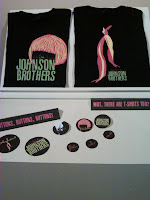
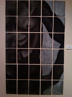
 I was really lucky to have known Michelle Anderson before the gallery, because I was able to talk a lot with her afterwards about her artwork, the gallery, and how everything went down for her. I was even able to sign her guest book, which made me pretty happy as well. But one of the most interesting things we talked about, was the concept of real art, and if there was such a thing. We've been talking in class about advertisments and such, and if they are considered art, and then this past week two out of the three walls of the gallery were covered in graphic design. Don't get me wrong, I love graphic design, and I thought some of the stuff in the gallery was awesome promo stuff. But what about Michelle's work? Creative expression, paint, photography...all things I couldn't have done in a million years. We talked during class about whether or not we could just create abstract art, and I admitted that I couldn't. However, I'm pretty damn good with computers and feel that some of the promo stuff, I could have created myself.
 I think there is an emotional level thrown into Michelle's art, as opposed to the other two artists. I feel like graphic design, although it is art and I strongly believe that, is commercial art. Consumer art. Capitalist art. Where paintings, photography, moments in time...are captured. They just are. Without anything else around them, with nothing to promote and nothing to gain, they can exist. They require no computer, no program, no printer. They require a human, and a paint brush, pencil, pen, charcoal, whatever...and they are sprung into life.


 Songs play an important part in advertising too, and could be considered miniature clips of film as far as television ads go. Take, for example, the Mitsubishi Ecplise ad from 2003 featuring the song "Days Go By" by Dirty Vegas.
